The Denver Nuggets have made several tweaks recently.
They’ve changed their core group of players, their GM and their coach over the last several years.
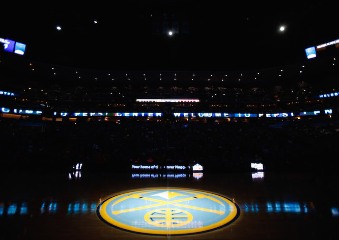
And now, they’ve re-designed the look of their court at Pepsi Center. Check it out.
Ooooooh we have a new court design this year!
Details: http://t.co/H2VAHtbSfN #Nuggets pic.twitter.com/RPS3g0faKM
— Denver Nuggets (@nuggets) September 24, 2015
That’s awesome!
Here are some details from the team’s website:
Upon first glance, fans will immediately notice the center court logo has been replaced with the Nuggets’ primary mountain peak logo. The Nuggets iconic pick axes that comprise their secondary logo have been moved to encompass the entire area inside the three-point lines with a two-tone treatment to the hardwood. The key or free throw lane now has all paint removed allowing the classic woodgrain to show through with the large pick axes crossing just in front of the basket. A two-tone mountain range will also be added along the sideline spanning across the timeline below the center court primary logo. Below the mountain range, the numbers 5280 and 300 are another fresh addition, symbolizing Denver’s altitude of 5,280 feet and the front range’s historical average of 300 days of sunshine per year. The “DENVER NUGGETS” text along each baseline has also been updated to match the new western inspired font of the new home and away uniform designs. The Nuggets website and Twitter handles are still present along the sideline near the coaches boxes and team benches, with the NBA’s logo at center court in front of the scorer’s table.
The Nuggets and Suns square off on this very court in a preseason game October 16.
Basketball season will be here sooner than you realize.
